Navigating and celebrating aging
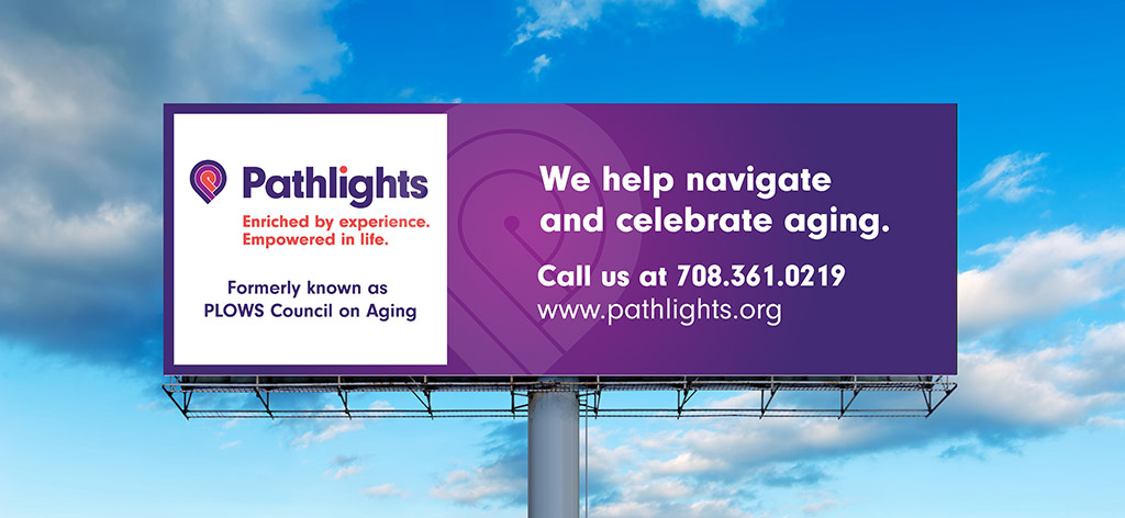
For more than 45 years PLOWS Council on Aging has provided meals, programs, and social services for older adults in the south suburban area of Chicago. The challenge was their name didn’t evoke their mission nor describe their services. It was a frequent source of misunderstanding amongst the populations they serve.
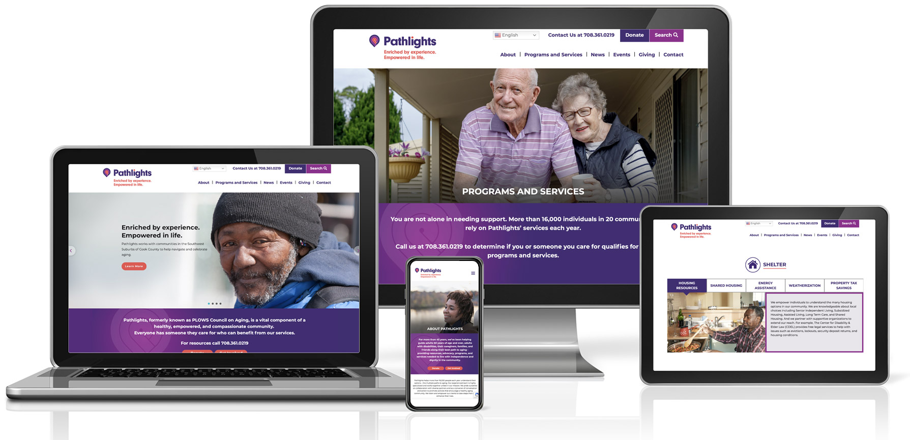
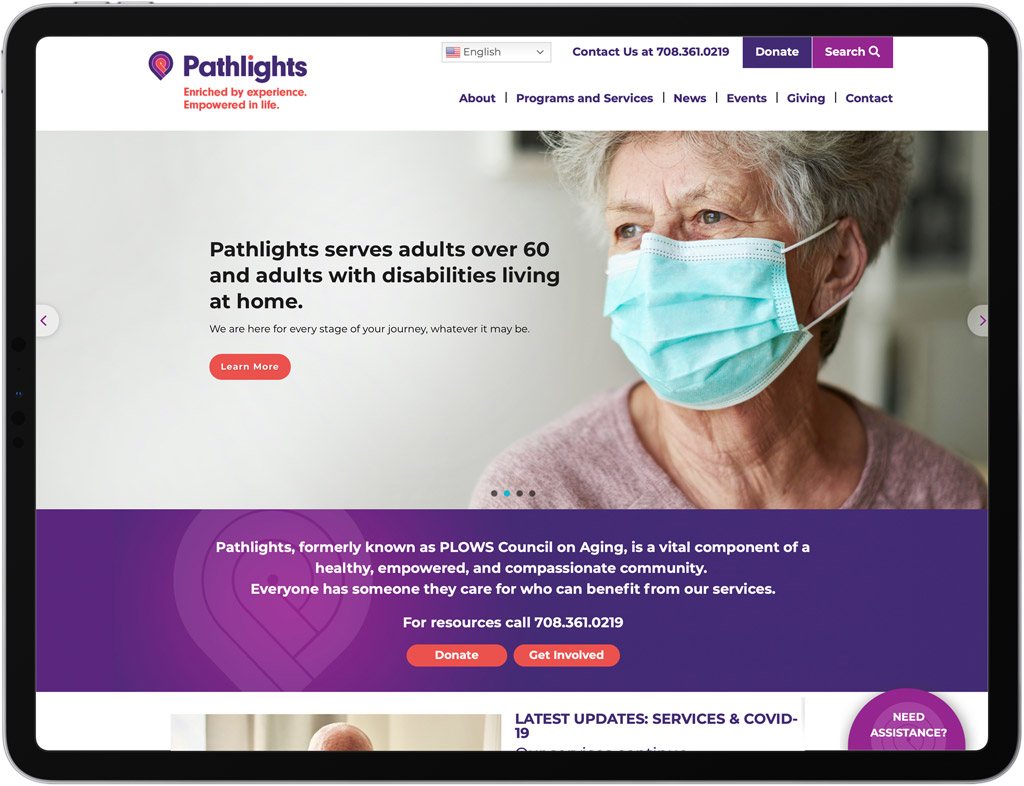
Substance developed the name Pathlights to evoke the shared path older adults take in the aging process, and the assistance given along the way. The logo is meant to suggest a series of paths that emanate from a P letterform. The colored dot on the i letterform underscores this message of providing light and guidance.
Brand Vision
Aging means different things to different people. People plan their education, careers, and finances. We seldom plan aging. If we’re lucky, we will all age and become older adults. We don’t have to age, we get to age. This was the central concept Substance created as a governing principle for the new Pathlights brand.
Pathlights is not just for older adults. Pathlights is here for the entire community, and the name, logo, and visual identity convey this more expansive outreach.


We knew that a new name and brand were necessary, but the prospect of rebranding an organization with a 45 year name and heritage was somewhat daunting. Substance carefully navigated us through each phase of the process, developing clear, actionable research and strategy, culminating in a new name and brand that was transformative. They listened carefully at every juncture, and delivered a brand that allows for us to move our mission forward.