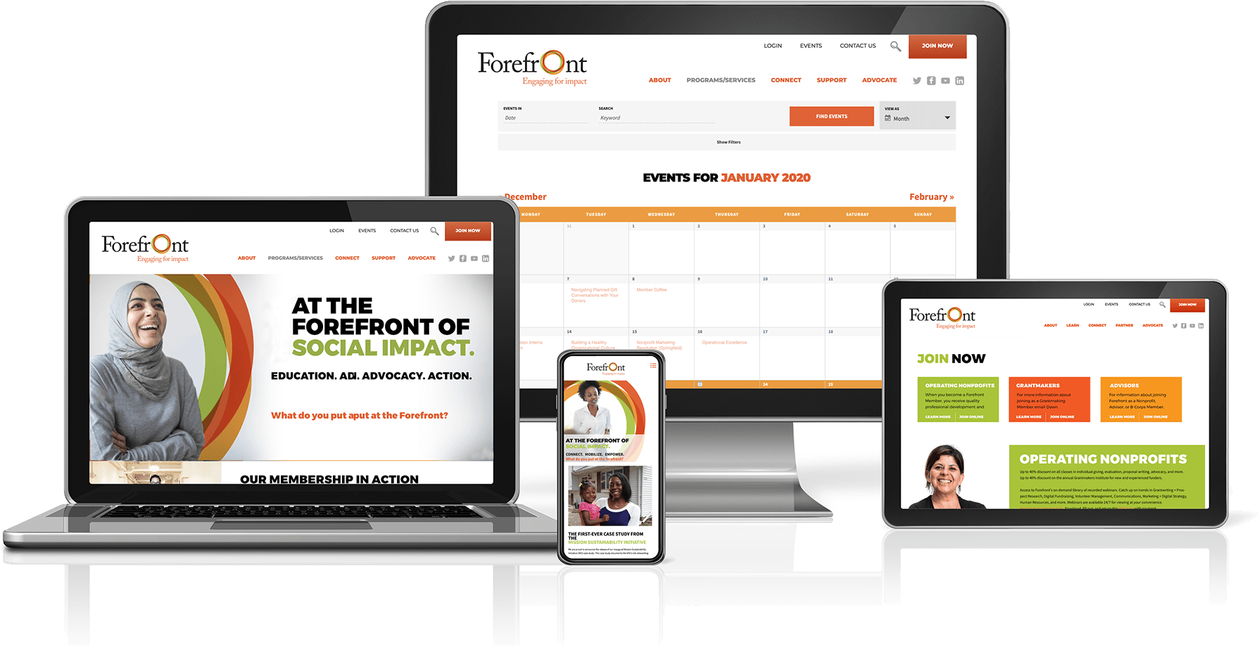
Moving Donors Forum to the forefront
Donors Forum was the largest and oldest network of not for profit and social impact organizations in Illinois. With a 40 year history of improving the quality of life for all people in the state, they had a rich history of success and significant brand equity in their name and brand. However, the not for profit landscape has changed significantly over the years. Their organization mission has shifted from transactional relationships to those based on creating impact.
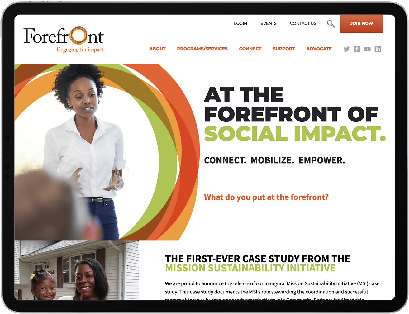
Substance came up with the name Forefront to highlight the leading edge nature of their mission. The overlapping circles represent the notion that individuals and organizations are made stronger by working in concert with other. The circles also represent the rich diversity of our state – its people, its geography, and its promise. The colors are a direct nod to their mission: Building a vibrant social impact sector for all the people of Illinois.

Brand Vision
The membership of Forefront is incredibly diverse, but the common denominator is all the organizations are driven to make Illinois a better place. Their strength is their diversity and their shared mission. The overlapping colors represent this intersection of a common set of interests, and the resulting strength borne from this union. The symbol also serves as a way to visually highlight various missions and causes throughout the brand architecture.
